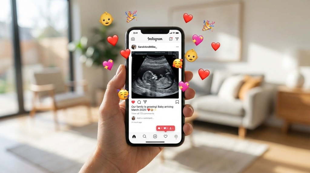
Your fake ultrasound looks off. Your friend squinted at it too long. Your sister said “wait, this doesn’t look right.” I have seen this happen dozens of times. After creating and reviewing hundreds of fake ultrasounds over the years, I spot the telltale signs of a bad one from across the room.
The difference between a fake ultrasound that fools everyone and one that gets called out in seconds comes down to a handful of details. Most of them are fixable.
This guide covers everything making a fake ultrasound look realistic. I also cover the common mistakes giving them away instantly.
Understanding What a Real Ultrasound Looks Like
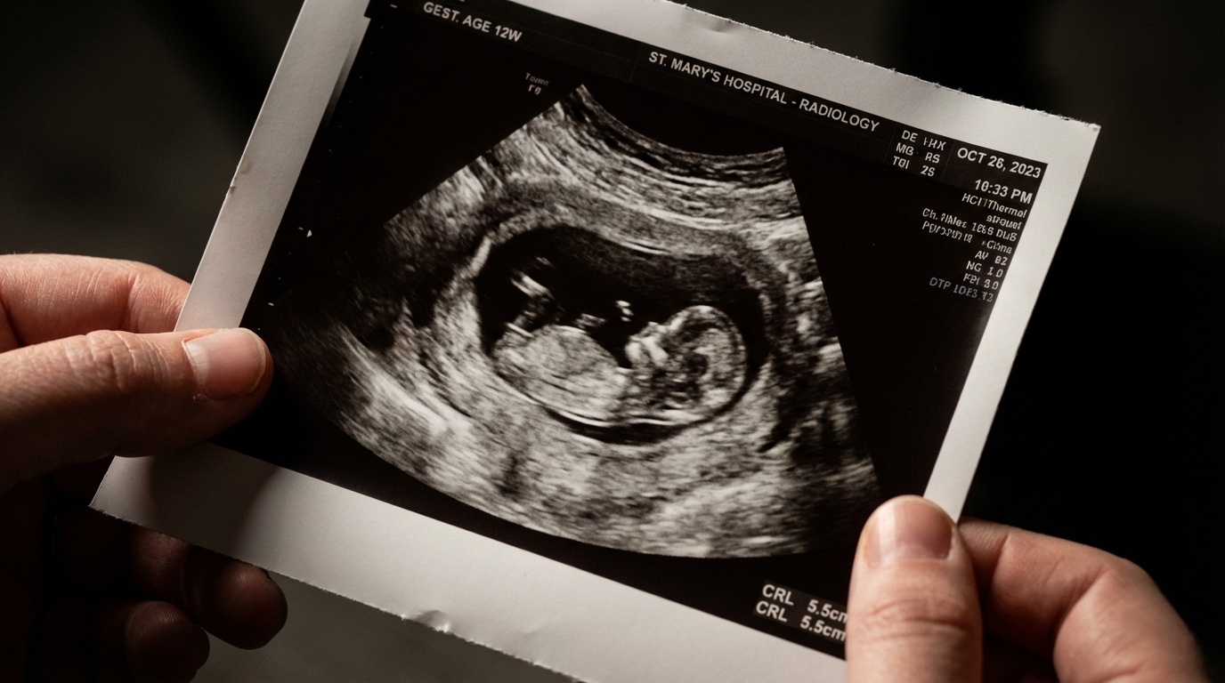
Before you fake something convincingly, you need to understand the real thing. Real ultrasounds have a specific look created by medical imaging technology. This look is hard to replicate if you do not know what you are going for.
The Key Visual Elements
Every authentic ultrasound has these core components:
- The fan-shaped viewing area: This distinctive cone or pie-slice shape comes from how the transducer emits sound waves. It is not a rectangle. It curves outward from a point at the top.
- The grainy, speckled texture: Real ultrasounds have a specific kind of visual “noise” coming from the way ultrasound waves interact with tissue. It is not smooth, but it is not random static either.
- Dark and light areas: Fluid appears black (like amniotic fluid around the baby), while tissue and bone appear in various shades of gray and white.
- The header information: Patient name, date, hospital name, and technical settings all appear in specific fonts and positions.
- Scale markers and measurements: Real ultrasounds include measurement markers and often have specific anatomical measurements noted.
If any of these elements are missing, wrong, or in the wrong place, experienced eyes notice immediately.
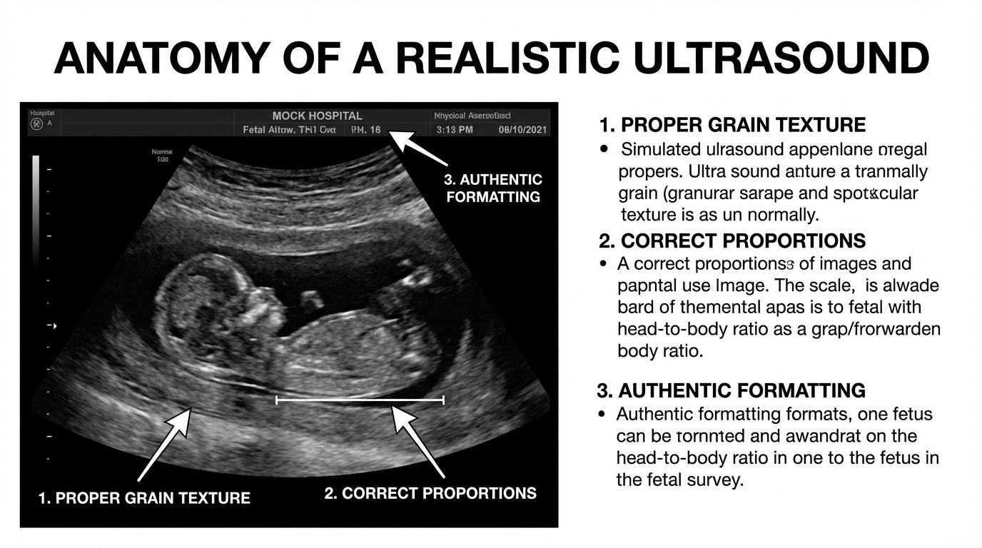
The Secret Sauce: Texture and Grain
This is the single biggest thing separating convincing fakes from obvious ones. Real ultrasounds have a specific texture almost impossible to describe but instantly recognizable once you know what to look for.
What Real Ultrasound Grain Looks Like
The “grain” in a real ultrasound comes from something called speckle. These are interference patterns created by the ultrasound waves bouncing off tiny structures in tissue. Here is what to understand:
- It is consistent but not uniform: The grain varies slightly in different areas but maintains a similar character throughout
- It has a specific scale: The speckles are small but visible, not tiny pinpoints or big blobs
- It is organic-looking: Think of it like the texture of granite or dense fog, not like TV static or digital noise
- The edges are slightly soft: Real ultrasound images have a dreamy, slightly fuzzy quality. Sharp crisp edges are a dead giveaway of digital creation.
What Bad Texture Looks Like
I have seen every mistake in the book when it comes to texture:
- Too smooth: The image looks like a 3D render or illustration with no texture at all
- Wrong type of noise: Digital camera noise or Gaussian blur looks nothing like ultrasound speckle
- Inconsistent grain: The background has one texture while the baby shape has another (or none)
- Over-sharpened edges: When someone tries to make the baby “pop” by sharpening, it destroys the authentic soft look
Formatting Details Making or Breaking Realism
Beyond the image itself, the formatting and technical details around the edges are where most fakes fall apart. These seem like small things, but they are what people look at first.
The Header Information
Real ultrasounds display patient information in specific ways:
- Font matters: Medical equipment uses basic system fonts like Arial, Courier, or equipment-specific sans-serif fonts. Decorative fonts are an instant red flag.
- Position is standardized: Patient name goes in a specific spot, usually top left. Date and time in another. Hospital name often at top center or corner.
- The format is clinical: Names appear as “LAST, FIRST” or “PATIENT: NAME”, not informal first-name-only formats.
Technical Settings and Measurements
The sides and corners of real ultrasounds contain technical gibberish most people ignore. But it needs to be there and look right:
- Depth markers: A scale showing centimeters (usually labeled “cm” or with hash marks)
- Machine settings: Things like “2D,” frequency settings (like “C5-2”), gain levels
- Measurement callouts: If there are measurements shown, they need appropriate labels (CRL for crown-rump length, BPD for biparietal diameter, etc.)
Getting Proportions and Positioning Right
The fetal shape itself needs to match the gestational age you are claiming. This is where a lot of template-based fakes get caught. They use a generic baby shape regardless of the date shown.
What Each Stage Looks Like
| Gestational Age | What It Should Look Like | Common Mistakes |
|---|---|---|
| 6-8 weeks | Small bean or oval shape, barely recognizable, yolk sac visible | Using a baby shape too defined or human-looking |
| 10-12 weeks | Head and body visible but proportions unusual (big head), limb buds starting to show | Head-to-body ratio too normal, features too clear |
| 18-22 weeks | Profile clear, limbs visible, often in curled position, anatomy scan details | Wrong positioning, floating in center instead of curved around uterus |
| 28+ weeks | Less of baby visible at once (too big to fit), usually face or specific body part focus | Showing entire baby clearly visible is not possible at this stage |
Position Within the Frame
The baby does not float in the center of a black void. In real ultrasounds:
- The baby is surrounded by amniotic fluid (darker area)
- The uterine wall is visible at the edges
- The placenta shows on one side
- The baby is often positioned at an angle, not perfectly upright or horizontal
- The viewing angle varies. You see a profile, cross-section, or head-on view depending on the type of scan.
The Top Mistakes Giving Fakes Away Instantly
After years in this space, I have developed an eye for spotting fakes immediately. Here are the mistakes I see over and over:
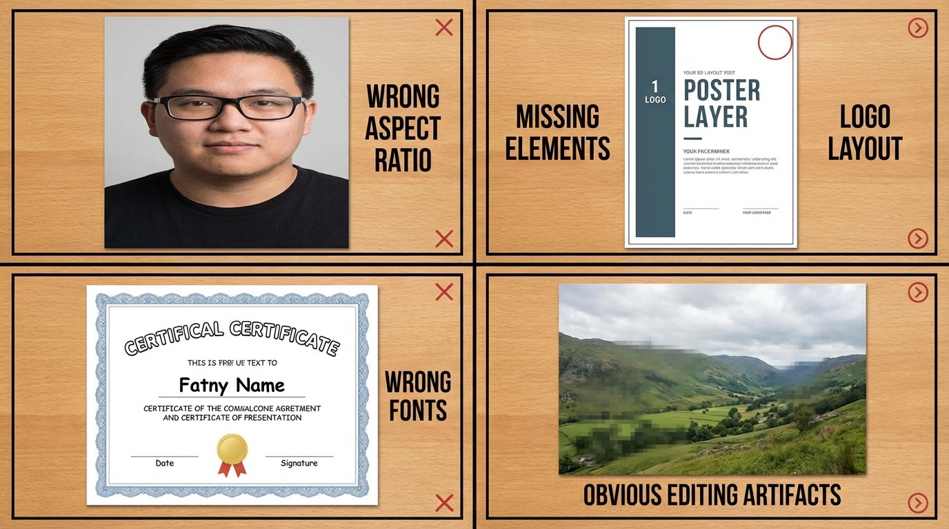
1. Wrong Aspect Ratio
Real ultrasounds have a specific shape. They are usually slightly wider than tall, in the distinctive fan shape. When people crop or resize images incorrectly, the proportions look off.
2. Clip Art Baby
I see fakes using a baby silhouette looking like clip art all the time. The shapes are too perfect, too symmetrical, with cartoon-like edges. Real ultrasound images have organic, somewhat blobby shapes because they are showing tissue density.
3. Perfect Black Background
The dark areas in real ultrasounds are not pure black. They have subtle texture and variation. If the background is solid, flat black, it screams “Photoshopped.”
4. Missing or Wrong Technical Elements
No depth markers. No machine settings. Wrong date format. Hospital name in the wrong position. These small details are easy to overlook but hard to get right without attention.
5. Wrong Font Choices
Nothing says “fake” like seeing the patient name in Times New Roman, Comic Sans, or any stylized font. Medical equipment uses boring, utilitarian fonts.
6. Measurements Not Matching
If the ultrasound shows “12 weeks” but the measurements listed would indicate a 20-week pregnancy, anyone knowing anything about ultrasounds will notice.
7. Too High Resolution
Real ultrasounds have a somewhat grainy, lower-resolution look. If your fake is crystal clear 4K quality, it is going to look wrong.
8. Inconsistent Quality
Some parts of the image look high-quality while others look different. This usually happens when someone pastes elements together from different sources.
My Complete Realism Checklist
Before showing your fake ultrasound to anyone, run through this checklist. I use it myself and it catches 95% of issues:
Image Quality:
- ☐ Consistent grain/texture throughout the entire image
- ☐ Soft edges, no over-sharpening
- ☐ Appropriate resolution (not too crisp)
- ☐ Subtle variation in dark areas (not flat black)
Shape and Structure:
- ☐ Fan-shaped viewing area (not rectangular)
- ☐ Baby proportions match the stated gestational age
- ☐ Organic, realistic shapes (not clip art)
- ☐ Baby positioned naturally within the frame
Technical Details:
- ☐ Depth scale on the side
- ☐ Machine settings visible
- ☐ Measurements appropriate to gestational age
- ☐ Proper labeling on any measurements shown
Header Information:
- ☐ Patient name in correct position and format
- ☐ Date in appropriate format (matches region/hospital)
- ☐ Hospital/clinic name present
- ☐ Basic system fonts used (nothing decorative)
Final Test:
- ☐ Would pass the “squint test” at arm’s length
- ☐ Nothing jumps out as wrong at first glance
- ☐ Consistent quality throughout, no frankenstein elements
The DIY Reality Check
I have given you everything you need to evaluate and improve a fake ultrasound. But getting all of this right is difficult. Even with photo editing skills, the learning curve for realistic texture, proper formatting, and gestational accuracy is steep.
If you are using this for something where it matters, like announcing to grandparents, pulling a prank on your partner, or using as a visible prop, the stakes of getting caught are real. A bad fake does not work. It is embarrassing.
After spending hours trying to get it right, most people end up wishing they had ordered from a professional service. Baby Maybe Shop handles all the technical details I have described: realistic texture, proper formatting, appropriate proportions for any gestational age. And they do custom work, so you get what you need.
Related Tutorials
Want to go deeper? Check out these related guides:
- How to Make a Fake Ultrasound – The complete DIY guide
- How to Customize Your Fake Ultrasound – All the personalization options
- How to Print Your Fake Ultrasound – Paper and printing guide for best results
- Real vs Fake Ultrasound – Understanding the differences in detail
- Best Fake Ultrasound Websites – Where to get professional results
Frequently Asked Questions
What is the most common giveaway on a fake ultrasound?
Texture, without question. Most fakes either have no grain (too smooth) or the wrong type of noise. Real ultrasound speckle has a specific look hard to replicate digitally. The second most common issue is wrong fonts in the header information.
Is it possible to fix a bad fake ultrasound I already have?
Sometimes. If the main issues are with formatting and text, those are often correctable. If the fundamental image quality or baby shape is wrong, it is usually easier to start over than to fix it. Adding realistic grain to a smooth image is particularly difficult to do convincingly.
Do different gestational ages require different approaches?
Yes. A 6-week ultrasound looks completely different from a 20-week anatomy scan. Not the baby’s shape, but the overall composition, what is visible, and how much detail is present. All of it changes. Make sure whatever fake you are using matches the gestational age you are claiming.
How close do people look at these?
More closely than you would think. Especially if it is someone who has had their own ultrasounds before, or anyone in a medical field. They will not consciously know what is wrong, but they will feel like something is off. Getting the details right matters.
Is getting a professional fake worth the money?
If it matters whether people believe it, yes. A professional service like Baby Maybe takes care of all the technical details: texture, formatting, proportions, even printing on the right paper. For something you are going to show to family or use in any situation where you do not want to get called out, it is worth it.
What if I need something for a quick joke?
If it is low-stakes, like a silly social media post where everyone knows it is fake, then sure, a free app or template works fine. But if you want people to believe it, even for a few seconds, quality matters. Check out our free vs paid comparison to understand the tradeoffs.